08 Jul 2018
Categories:
Tags:
 The aftermath of the 2008 subprime mortgage crisis has been terrible for many, but it created growth opportunities for new players in the retail credit field.
Following the credit scarcity that took place briefly during those times, some new internet companies have thrived, with a new business model that would become known as Peer-to-Peer Lending — or simply P2P Lending.
From its inception in the end of the last decade until now, amounts lent through P2P Lending marketplaces have grown impressively. According to PwC, U.S. peer-to-peer lending platforms’ origination volumes have grown an average of 84% per quarter since 2007.
Using Data Science, Exploratory Data Analysis, Machine Learning and public data from Lending Club, a popular P2P Lending marketplace, we will investigate this scenario further. Throughout a series of posts, we will cover the following dimensions:
- Loan Variables such as loan amount, term, interest rate, delinquency
- Borrower Profile Variables such as employment status, relationship status
- Miscellaneous Variables and other factors such as macroeconomic, geographic
Questions to be Answered
Our objective will be to analyze this data in order to answer to the questions below:
- How does the loan data distribution look like? Using Data Science, we will paint a picture detailing the most important aspects related to the loans and perform EDA (Exploratory Data Analysis).
- Are the loan grades from LC optimal? Loan grades are critical for P2P Marketplaces, as they measure the probability of a client going incurring into default, thus being crucial for businesses’ profitability.
- Can we create a better, optimized model to predict credit risk using machine learning, and beat the FICO Score? We will try to beat the loan grades assigned by LC, by creating a new machine learning model from scratch.
Lending Club Data: An Outlook
 Lending Club was one of the first companies to create an online marketplace for P2P Lending back in 2006.
It gained substantial traction in the wake of the 2008 crisis — partly due to changes in traditional banks’ capability and willingness to lend back then.
In this post, we will use data science and exploratory data analysis to take a peek Lending Club’s loan data from 2007 to 2015, focusing on the following questions regarding this period:
- Loan Absolute Variables Distribution: How does loan value, amount funded by lender and total committed by investors distribution looks like?
- Applications Volume: How many loan applications were received?
- Defaults Volume: How many loans were defaulted?
- Average Interest Rates: What was the average interest rate?
- Loan Purpose: What were the most frequent Loan Purposes?
- Loan Grades: How worthy are the loans?
- Delinquency Breakdown: How many loans were Charged Off?
By analyzing these aspects, we will be able to understand our data better and also get to know a bit of Lending Club’s story.
The dataset contains 887K loan applications from 2007 through 2015 and it can be downloaded from Kaggle.
Loan Absolute Variables Distribution
 In the dataset we have three absolute variables relating to the loans: loan amount, amount funded and total committed by investors.
These variables are similarly distributed, which shows that there is an adequate balance between funding and credit.
Applications Volume
Below we can see an evolution of Loan Applications that were issued YoY — year over year basis from 2007 to 2015.
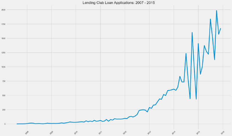 We can see that loan applications have raised steadily from mid 2007 until 2014.
There are definitely two distinct graph patterns considering pre-2014 and post-2014.
From early 2014 until mid 2014, we can see a boom in loan applications volume, only to see a violent drop after this period, with the pattern repeating itself.
What could be reasons for that?
- IPOs are the holy grail for every startup (or at least, for its investors). Lending Club went public in late 2014 — it could have been preparing for an IPO prior to this period and hence adopted more aggressive growth measures.
- Startups preparing for IPOs garner more attention from regulators and the SEC. This equals tomore strict risky capital controls, hence the sudden drops in this variable.
- In 2014, Lending Club acquired Springstone Financial for US$ 140 million in cash. To that date, Springstone Financial had financed its consumer loans with traditional bank debt (who faced more SEC and FED scrutinity than P2P Marketplaces at that time). This could have meant more stringent compliance, liquidity and credit risk controls.
Defaults Volume
How many loans were defaulted?
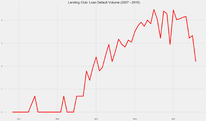 Loan defaults have seen a massive growth from 2012 until the middle of 2014. From this period until the end of 2014, the default growth pace has pretty much followed loan application volume.
By late 2015, defaulted loans volume reached 2013 levels.
In the plot below we can see a comparison between the Loan Applications and Loan Defaults in log scale.
 Take a look at the period between mid 2014 and early 2015.
As of 2015, looks like Lending Club was going through a perfect storm — loan applications were rising and loan defaults were diminishing.
Loan Purpose
What were the most frequent Loan Purposes?
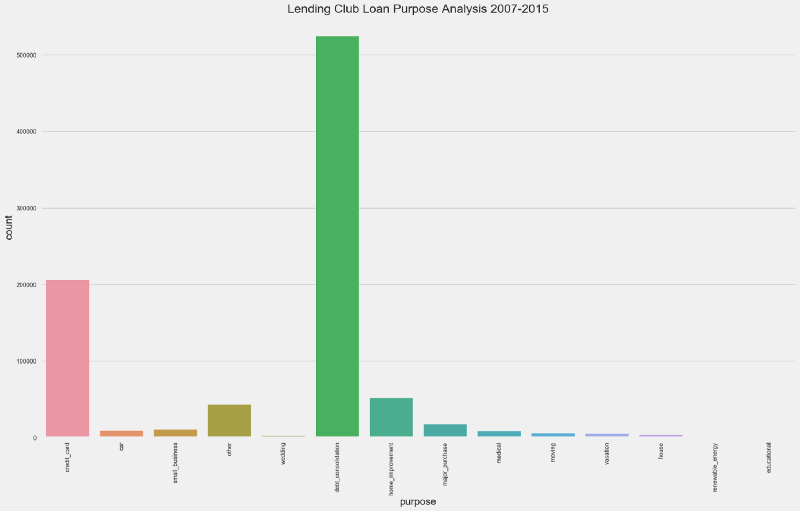 Debt Consolidation stands as clear winner for loan purpose, with more than 500K loans — or 58% from the total.
Other highlights include:
- Credit Card — more than 200K (~20%)
- Home Improvement — more than 50K (~8%)
- Other Purposes— less than 50K (~3%)
Average Interest Rates
What was Lending Club’s the average interest rate between 2007 and 2015?
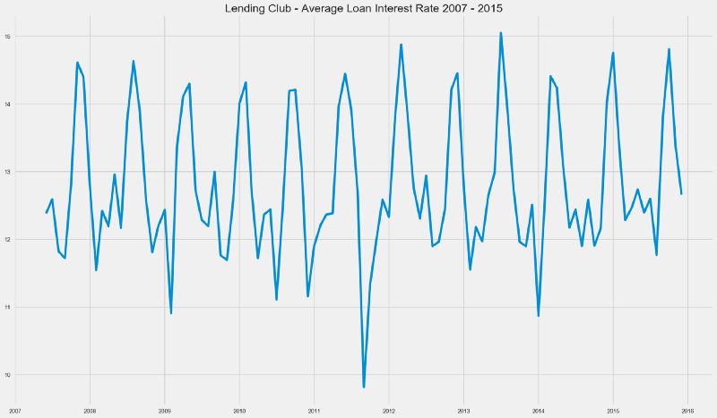 Loan Interest Rates have followed an interest pattern over these years. One could also hint at it being a Stationary Time Series.
While checking for Time Series Stationarity is beyond the scope of this initial article, it would surely be an interesting matter to revisit in the future.
Delinquent Loans
Delinquency happens when a borrower fails to pay the minimum amount for an outstanding debt.
In the countplot below we can see the amount of loans that incurred in any stage of delinquency, according to the definitions used by Lending Club.
- Charged Off — defaulted loans for which there is no expectation from the lender in recovering the debt
- Default— borrower has failed to pay his obligations for more than 120 days
- Late —borrower has failed to pay his obligations for 31 to 120 days
- Grace Period — borrower still has time to pay his obligations without being considered delinquent
- Late — payment is late by 16 to 30 days
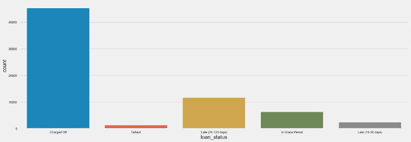 The amount of Charged Off loans seems impressive — for more than 40K loans, borrowers were not able to pay their obligations and there was no longer expectation that they would be able to do so.
In relative terms, charged off loans represented less than 5% of the total loans.
Loan Grades
Loan Grades and Subgrades are assigned by Lending Club based on the borrower’s credit worthiness and also on some variables specific to that Loan.
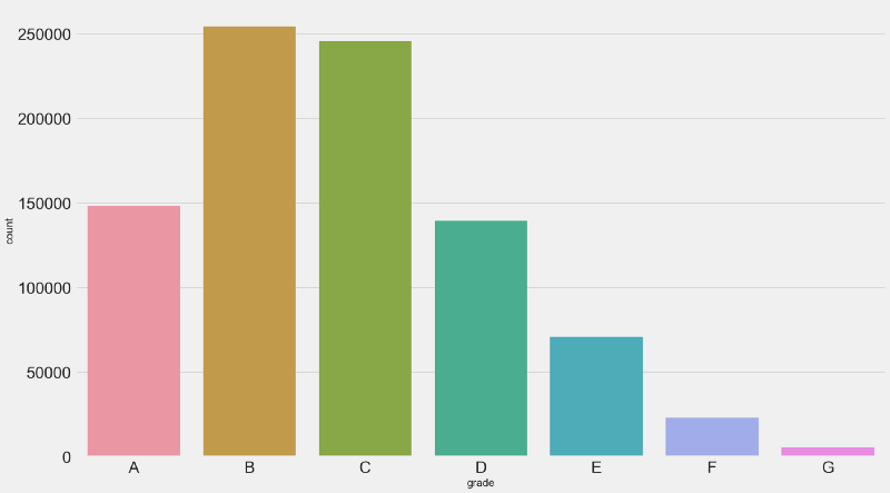 Countplot for past loan grades.The majority of loans is either graded as B or C — together these correspond to more than 50% of the loan population.
While there is a considerable amount of A graded or “prime” loans (~17%), there is a small amount of G graded, or “uncollectible” loans (~0,06%). Which is a good sign for Lending Club.
But, are these the right grades?
Let’s zoom into the loan subgrades for delinquent loans and find out.
Delinquency Breakdown
From the entire loan population, we have 67K delinquent loans (~7.5%).
Let’s zoom in a bit into the delinquent loans by analyzing their Grades and Subgrades.
 Looking at 67K delinquent loans, we have the following highlights:
- 2.5K (~4%) loans with an Grade A were charged off
- 9.5K (~14%) loans with Grade B were charged off
- 12.8K (~20%) loans with Grade C were charged off
Intuitively, we would expect grades worse than C to be the worse payers than A, B and C — something that doesn’t quite happen here. For an optimal grading system we would expect the amount of charged off loans to be in line with the amount of G Graded loans.
Maybe there’s a problem with these grades?
Let’s check the opposite side first — the good payers.
What were the grades and subgrades for loans that were fully paid?
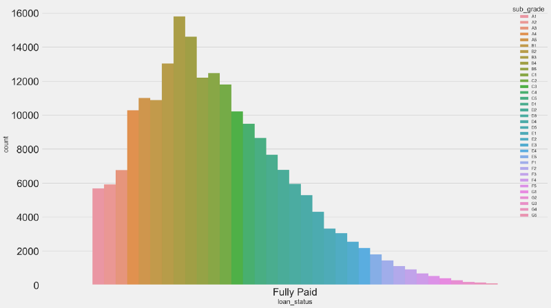 From 43K A Graded Loans:
- 2.5K were charged off (~5.8%)
- 40K were fully paid (~93%)
- 500 were either defaulted, late or in grace period (~1,16%)
This begs the question: are these loan grades optimal?
We have some indications that they are not. Are these indications enough?
We will analyze this further in the next posts.
Credit Risk Modeling is such an exciting field for applying Data Science and Machine Learning. The possibilities for optimization are endless — and we’re just getting started.
For now, I hope you enjoyed this initial analysis and be sure that there is more to come.
You Might Also Like
Keeping Your Machine Learning Models on the Right Track: Getting Started with MLflow, Part 2
Learn how to use MLflow Model Registry to track, register and deploy Machine Learning Models effectively.mlopshowto.comAbout MLOps And Why Most Machine Learning Projects Fail — Part 1
If you have been involved with Machine Learning (or you are aiming to be), you might be aware that reaping the…mlopshowto.com
27 Jun 2018
Categories:
Tags:
The main challenge when it comes to modeling fraud detection as a classification problem comes from the fact that the majority of transactions is not fraudulent, making it hard to train an ML model.
 For years, fraudsters would simply take numbers from credit or debit cards and print them onto blank plastic cards to use at brick-and-mortar stores. But in 2015, Visa and Mastercard mandated that banks and merchants introduce EMV — chip card technology, which made it possible for merchants to start requesting a PIN for each transaction.
Nevertheless, experts predict online credit card fraud to soar to a whopping $32 billion in 2020.
Putting it into perspective, this amount is superior to the profits posted recently by some worldwide household, blue chip companies in 2017, such as Coca-Cola ($2 billions), Warren Buffet’s Berkshire Hathaway ($24 billions) and JP Morgan Chase ($23.5 billions).
In addition to the implementation of chip card technology, companies have been investing massive amounts in other technologies for detecting fraudulent transactions.
Would Machine Learning & AI constitute great allies in this battle?
Classification Problems
 In Machine Learning, problems like fraud detection are usually framed as classification problems —predicting a discrete class label output given a data observation. Examples of classification problems that can be thought of are Spam Detectors, Recommender Systems and Loan Default Prediction.
Talking about the credit card payment fraud detection, the classification problem involves creating models that have enough intelligence in order to properly classify transactions as either legit or fraudulent, based on transaction details such as amount, merchant, location, time and others.
Financial fraud still amounts for considerable amounts of money. Hackers and crooks around the world are always looking into new ways of committing financial fraud at each minute. Relying exclusively on rule-based, conventionally programmed systems for detecting financial fraud would not provide the appropriate time-to-market. This is where Machine Learning shines as a unique solution for this type of problem.
The main challenge when it comes to modeling fraud detection as a classification problem comes from the fact that in real world data, the majority of transactions is not fraudulent. Investment in technology for fraud detection has increased over the years so this shouldn’t be a surprise, but this brings us a problem: imbalanced data.
Imbalanced Data
 Imagine that you are a teacher. The school director gives you the task of generating a report with predictions for each of the students’ final year result: pass or fail. You’re supposed to come up with these predictions by analyzing student data from previous years: grades, absences, engagement together with the final result, the target variable — which could be either pass or fail. You must submit your report in some minutes.
The “problem” here is that you are a very good teacher. As a result, almost none of your past students has failed your classes. Let’s say that 99% of your students have passed final year exams.
What would you do?
The most fast, straightforward way to proceed in this case would be predicting that 100% of all your students would pass. Accuracy in this case would be 99% when simulating past years. Not bad, right?
This happens when we have imbalance.Would this “model” be correct and fault proof regardless of characteristics from all your future student populations?
Certainly not. Perhaps you wouldn’t even need a teacher to do these predictions, as anyone could simply try guessing that the whole class would pass based on data from previous years, and still achieve a good accuracy rate. Bottomline is that this prediction would have no value. And one of the most important missions of a Data Scientist is creating business value out of data.
We’ll take a look into a practical case of fraud detection and learn how to overcome the issue with imbalanced data.
Our Data
 Our dataset contains transactions made by credit cards in September 2013 by european cardholders. This dataset presents transactions that occurred in two days, where we have 492 frauds out of 284,807 transactions. The dataset is highly imbalanced, with the positive class (frauds) accounting for 0.172% of all transactions.
 First 5 observations from our data, showing the first 10 variables.It is important to note that due to confidentiality reasons, the data was anonymized — variable names were renamed to V1, V2, V3 until V28. Moreover, most of it was scaled, except for the Amount and Class variables, the latter being our binary, target variable.
It’s always good to do some EDA — Exploratory Data Analysis before getting our hands dirty with our prediction models and analysis. But since this is an unique case where most variables add no context, as they’ve been anonymized, we’ll skip directly to our problem: dealing with imbalanced data.
 Only 0.17% of our data is positively labeled (fraud).There are many ways of dealing with imbalanced data. We will focus in the following approaches:
- Oversampling — SMOTE
- Undersampling — RandomUnderSampler
- Combined Class Methods — SMOTE + ENN
Approach 1: Oversampling
One popular way to deal with imbalanced data is by oversampling. To oversample means to artificially create observations in our data set belonging to the class that is under represented in our data.
One common technique is SMOTE — Synthetic Minority Over-sampling Technique. At a high level, SMOTE creates synthetic observations of the minority class (in this case, fraudulent transactions). At a lower level, SMOTE performs the following steps:
- Finding the k-nearest-neighbors for minority class observations (finding similar observations)
- Randomly choosing one of the k-nearest-neighbors and using it to create a similar, but randomly tweaked, new observations.
There are many SMOTE implementations out there. In our case, we will leverage the SMOTE class from the imblearn library. The imblearn library is a really useful toolbox for dealing with imbalanced data problems.
To learn more about the SMOTE technique, you can check out this link.
Approach 2: Undersampling
Undersampling works by sampling the dominant class to reduce the number of samples. One simple way of undersampling is randomly selecting a handful of samples from the class that is overrepresented.
The RandomUnderSampler class from the imblearn library is a fast and easy way to balance the data by randomly selecting a subset of data for the targeted classes. It works by performing k-means clustering on the majority class and removing data points from high-density centroids.
Approach 3: Combined Class Method
SMOTE can generate noisy samples by interpolating new points between marginal outliers and inliers. This issue can be solved by cleaning the resulted space obtained after over-sampling.
In this regard, we will use SMOTE together with edited nearest-neighbours (ENN). Here, ENN is used as the cleaning method after SMOTE over-sampling to obtain a cleaner space. This is something that is easily achievable by using imblearn’s SMOTEENN class.
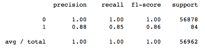
Initial Results
Our model uses a Random Forests Classifier in order to predict fraudulent transactions. Without doing anything to tackle the issue of imbalanced data, our model was able to achieve 100% precision for the negative class label.
This was expected since we’re dealing with imbalanced data, so for the model it’s easy to notice that predicting everything as negative class will reduce the error.
 We have some good results for precision, considering both classes. However, recall is not as good as precision for the positive class (fraud).
Let’s add one more dimension to our analysis and check the Area Under the Receiver-Operating Characteristic (AUROC) metric. Intuitively, AUROC represents the likelihood of your model distinguishing observations from two classes. In other words, if you randomly select one observation from each class, what’s the probability that your model will be able to “rank” them correctly?
 Our AUROC score is already pretty decent. Were we able to improve it even further?
So, Have We Won?
After using oversampling, undersampling and combined class approaches for dealing with imbalanced data, we got the following results.
 By using SMOTE in order to oversample our data, we got some mixed results. We were able to improve our recall for the positive class by 5% — we reduced false negatives. However, that came with a price: our precision is now 5% worse than before. It is common to have a precision — recall trade-off in Machine Learning. In this specific case, it is important to analyze how would this impact us financially.
In one side, we would have reduced the amount of false negatives. On the other side, due to the increase in false positives, we would be potentially losing clients due to wrongfully classifying transactions as fraud, as well as increasing operational costs for cancelling credit cards, printing new ones and posting them to the clients.
In terms of AUROC, we got a slightly better score:
 * RandomUnderSampler
Undersampling proved to be a bad approach for this problem. While our recall score has improved, precision for the positive class has almost vanished.
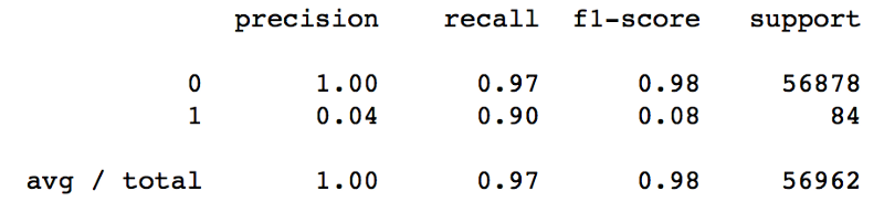 The results above show us that it wouldn’t be a good strategy to use undersampling for dealing with our imbalanced data problem.
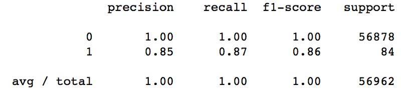 SMOTE + ENN proved to be the best approach in our scenario. While precision was penalized by 5% like with SMOTE, our recall score was increased by 7%.
As for the AUROC metric, the result was also better:
 ### Recap
In this post, I showed three different approaches to deal with imbalanced data — all of the leveraging the imblearn library:
- Oversampling (using SMOTE)
- Undersampling (using RandomUnderSampler)
- Combined Approach (using SMOTE+ENN)
Key Takeaways
- Imbalanced data can be a serious problem for building predictive models, as it can affect our prediction capabilities and mask the fact that our model is not doing so good
- Imblearn provides some great functionality for dealing with imbalanced data
- Depending on your data, SMOTE, RandomUnderSampler or SMOTE + ENN techniques could be used. Each approach is different and it is really the matter of understanding which of them makes more sense for your situation.
- It is important considering the trade-off between precision and recall and deciding accordingly which of them to prioritize when possible, considering possible business outcomes.
You Might Also Like
Keeping Your Machine Learning Models on the Right Track: Getting Started with MLflow, Part 2
Learn how to use MLflow Model Registry to track, register and deploy Machine Learning Models effectively.mlopshowto.comAbout MLOps And Why Most Machine Learning Projects Fail — Part 1
If you have been involved with Machine Learning (or you are aiming to be), you might be aware that reaping the…mlopshowto.comData Pipeline Orchestration on Steroids: Getting Started with Apache Airflow, Part 1
What is Apache Airflow?towardsdatascience.com### References
- Nick Becker — The Right Way to Oversample in Predictive Modelling
- Andrea Dal Pozzolo, Olivier Caelen, Reid A. Johnson and Gianluca Bontempi. Calibrating Probability with Undersampling for Unbalanced Classification. In Symposium on Computational Intelligence and Data Mining (CIDM), IEEE, 2015
17 Jun 2018
Categories:
Tags:
 ### Where it all Started
In my previous post, I described the process of hunting for an apartment in Amsterdam using Data Science and Machine Learning. Using apartment rental data obtained from the internet, I was able to explore and visualize this data. As part of the visualization part I was able to create the map below:
Ultimately I was able to use this data to build, train and test a predictive model using Random Forests. It was possible to achieve an R2 score of 0.70, which is a good measure for a baseline model. The results in terms of predictions versus actual values for the test set can be seen in the plot below:
 The idea of creating a predictive model out of this data was to have a good parameter in order to know if a rental listing had a fair price or not. This would allow us to find some bargains or distortions. The reasoning behind this was that if I came across any apartment with a rental price that was much lower than a value predicted by our model, this could indicate a good deal. In the end, this proved to be an efficient way for house hunting in Amsterdam as I was able to focus on specific areas, detecting some good deals and finding an apartment within my first day in the city.
 After finding an apartment in AMSNow going back to our model. Being a baseline model, there is potential room for improvement in terms of prediction quality. The pipeline below has become my favorite approach for tackling data problems:
- Start out with a baseline model
- Check the results
- Improve the model
- Repeat until the results are satisfactory
So here we are now, at step three. We need to improve our model. In the last post, I listed the reasons why I like Random Forests so much, one of them being the fact that you don’t need to spend a lot of time tuning hyperparameters (which is the case for Neural Networks for example). While this is a good thing, on the other hand it imposes us some limitations in order to improve our model. We are pretty much left with working and improving our data rather than trying to improve our predictive model by tweaking its parameters.
This is one of the beauties of Data Science. Sometimes it feels like an investigation job: you need to look for leads and connect the dots. It’s almost like the truth is out there.
 Look! An empty apartment in Amsterdam!So now we know that we need to work on our data and make it better. But how?
In our original dataset, we were able to apply some feature engineering in order to create some variables related to the apartment location. We created dummy variables for some categorical features, such as address and district. This way we ended up creating one variable for each address and district category, their value being either 0 or 1. But there is one aspect that we missed in this analysis.
Venice of the North
 Amsterdam has more than one hundred kilometers of grachten (canals), about 90 islands and 1,500 bridges. Alongside the main canals are 1550 monumental buildings. The 17th-century canal ring area, including the Prinsengracht, Keizersgracht, Herengracht and Jordaan, were listed as UNESCO World Heritage Site in 2010, contributing to Amsterdam’s fame as the “Venice of the North”.
 The addresses in Amsterdam usually contain information which allows one to know if a place sits in front of a canal or not — the so called “canal houses”. An apartment located at Leidsegracht most likely has a view to the canal, while the same cannot be said for an apartment located at Leidsestraat, for instance.There are also cases where buildings are located within a square, for example some buldings at Leidseplein.
Needless to say, canal houses have an extra appeal due to the beautiful view they provide. In Facebook groups it is possible to see canal houses being rented in the matter of hours after being listed.
 Who wants to live in a Canal House?We will extract this information from the apartments addresses in order to create three more variables: gracht, straat and plein, with 0 and 1 as possible values.The reason for creating separate variables for these instead of only one with different possible values (e.g. 1,2,3) is that in this case we would treat it as a continuous variable, tricking our model into considering this scale for means of importance. We will hopefully find out if canal houses are really that sought for.
Location, Location, Location
By observing the top 15 most important features from our model’s Feature Importance ranking, we are able to notice that besides latitude and longitude, many of the dummy variables related to address and district are valuable for our model in order to properly do its predictions. So we can say that location data is definitely promising.
We will expand on that. But again, the question is, how?
 Restaurants, bars and cafes near Leidseplein, Amsterdam.### Going Social
Besides having around 800K inhabitants — a small number when it comes to Western Europe capitals — Amsterdam is packed with bars, cafes, restaurants and has one of the best public transportation systems in Europe. However, it is important to think about our target subject: people. Our main objective here is understanding how people behave when looking for an apartment. We need to segregate our target into different groups, in a way that we can understand what they want in terms of housing and location. One could argue that being close to bars, cafes and restaurants is attractive for some kinds of people. Other people could be willing to live closer to parks and schools — couples with small kids, for example. Both types of people could also be interested in living close to public transportation, such as Tram and Bus stops.
 Amsterdam Centraal StationThis gives us some hints on formulating our hypothesis. Would proximity to these types of places impact apartment rental prices?
In order to test this hypothesis, we need to feed this data into our model.
Yelp is a social platform that advertises its purpose as “to connect people with great local businesses”. It lists spots such as bars, restaurants, schools and lots of other types of POI — points of interest throughout the world, allowing users to write reviews for places. Yelp had a monthly average of 30 million unique visitors who visited Yelp via the Yelp app and 70 million unique visitors who visited Yelp via mobile web in Q1 2018. Through Yelp’s Fusion API one can easily extract POI information passing latitude and longitude as parameters.
Yelp has some categories for places listed on its database (unfortunately, there is no category for coffeeshop). We are interested in the following:
Active Life: parks, gyms, tennis courts, basketball courts
Bar: bars and pubs
Cafe: self-explanatory
Education: kindergarten, high schools and universities
Hotels/Travel: hotels, car rental shops, touristic information points
Transportation: tram/bus stops and metro stations
For each of these categories, Yelp lists POI containing their latitude and longitude.
Our approach here will be:
- Querying the Yelp Fusion API in order to get data on POI for the categories above in Amsterdam
- Calculating the distance in meters between each apartment and each POI.
- Counting how many POIs from each category are within a 250 meters radius from each of the apartments. These numbers will become variables in our dataset.
 By using Yelp’s Fusion API we have been able to grab geographic data on 50 POI for each of the categories that are within our target.
Before we proceed to calculating the distance between each POI and each apartment, remember: Latitude and Longitude are angle measures.
Latitude is measured as the degrees to the north or south of the Equator. Longitude is measured as the degrees to the east or west of the Prime Meridian (or Greenwich) line. The combination of these two angles can be used to pinpoint an exact location on the surface of the earth.
 As shown in the image above, the quickest route between two points on the surface of the earth is a “great circle path” — in other words, a path that comprises a part of the longest circle you could draw around the globe that intersects the two points. And, since this is a circular path on a sphere using coordinates expressed in angles, all of the properties of the distance will be given by trigonometric formulas.
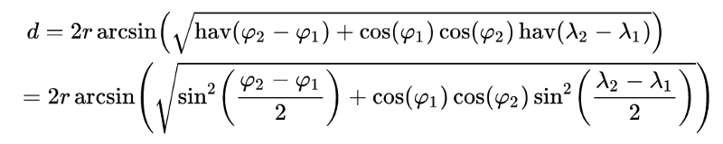 Haversine Formula.The shortest distance between two points on the globe can be calculated using the Haversine formula. In Python, it would look like this:
from math import sin, cos, sqrt, atan2, radians

# approximate radius of earth in km
R = 6373.0

lat1 = radians(52.2296756)
lon1 = radians(21.0122287)
lat2 = radians(52.406374)
lon2 = radians(16.9251681)

dlon = lon2 - lon1
dlat = lat2 - lat1

a = sin(dlat / 2)**2 + cos(lat1) * cos(lat2) * sin(dlon / 2)**2
c = 2 * atan2(sqrt(a), sqrt(1 - a))

distance = R * c
Now that we know how to calculate the distance between two points, for each apartment we will count how many POI from each of the categories are within a 250 meters radius.
After concatenating this data into our previous dataset, let’s have a glimpse at how it looks — notice the last columns on the right side:
 ### Putting it all Together
Let’s take a look at our dataset after adding these variables.
We’ll start out by getting some measures for descriptive statistics:
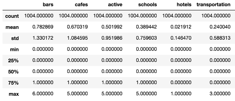 * Apartments have an average 0.7828 bars within 250 meters radius. Good news for those who like to go for a beer without walking (or tramming) too much.
- Cafes also seem to be widely spread across the city, with an average 0.6703 POI within walking distance from each apartment.
- The average quantity of transportation POI within 250 meters of apartments is close to zero.
We’ll now generate some boxplots for these variables and see how they influence normalized_price.
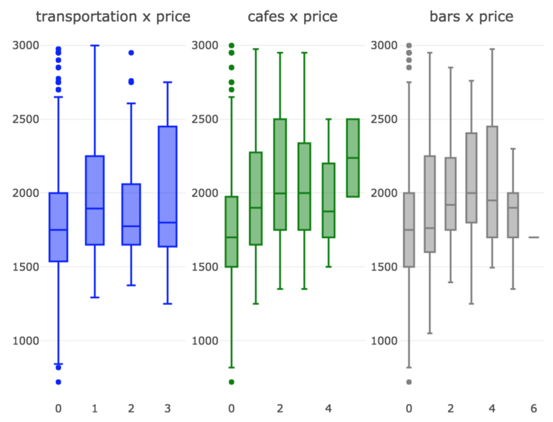 It looks like these three variables indeed have significant influence over normalized_price.
What about gracht, straat and plein?
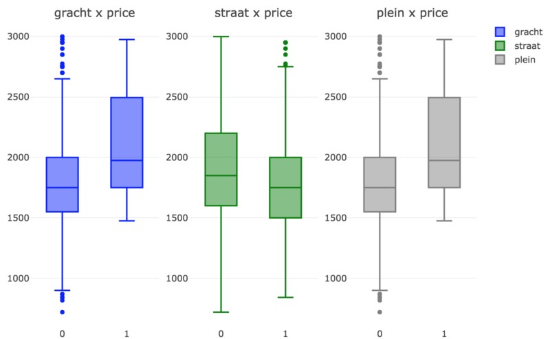 As expected, prices are slightly higher for canal houses (gracht) and also for apartments located in squares (plein). For apartments located in regular streets, prices are slightly lower.
Now we’ll wrap everything up and generate a heatmap through the Pearson Correlation matrix between the new variables we introduced in the model and our target variable, normalized_price.
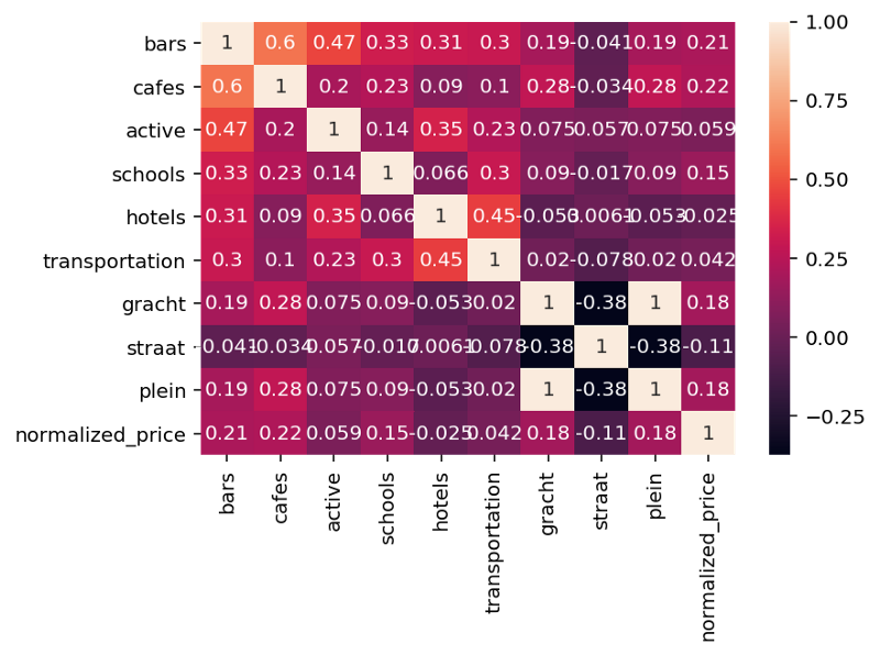 Unfortunately, our heatmap does not provide any indication of significant correlation between our new variables and normalized_price. But again, that doesn’t mean there is no relationship at all between them, it just means there is no significant linear relationship.
Going Green, Part 2
Now that we enriched our dataset, it’s time to train our model with the new data and see how it performs.
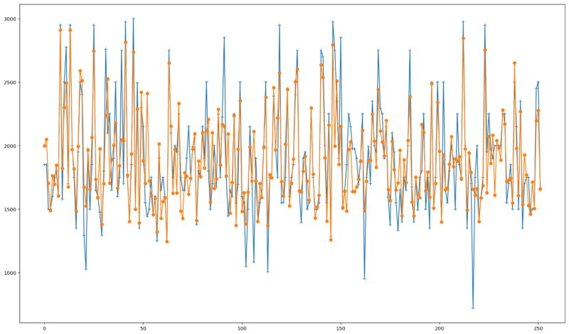
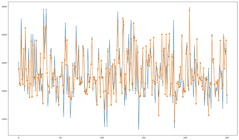 How our new predictions perform. Predicted values in orange, actual values in blue.We were able to increase our R2 Score from 0.70 to 0.75 —around 7.14% improvement considering our baseline model.
The plot above depicts the new predicted values we obtained in comparison with the actual ones. It is possible to see a small improvement specially for predicting values close to the maximum and minimum prices.
In terms of feature importances, something interesting occurred. Some of the new variables that we introduced gained substantial importance, thus removing importance from other variables. Notice how the dummy variables generated by the address variable lost importance. In the case of the district variables, they are not even part of the top 15 most important variables anymore. Probably we wouldn’t see much difference in our results should we want to remove these variables from our model.
It is also interesting to note that the quantity of transportation POI within a 250 meters radius is not as important as the quantity of cafes within this distance. One possible guess is that transportation is more homogeneously dispersed through the city — most apartments would be close to trams, bus or metro stops, while cafes might be concentrated in more central areas.
We explored much of the geographic data available. Perhaps a way to make our model even better would be getting information such as building construction date, apartment conditions and other characteristics. We could even play a bit with the geographic data and base our variables in a greater radius than 250 meters for POI. It is also possible to explore other Yelp categories such as shops, grocery stores, among many others and see how they affect rental prices.
Key Takeaways
- Improving a model’s prediction capacity is not a trivial task and may require a bit of creativity to find ways of making our data richer and more comprehensive
- Sometimes a small model improvement requires a decent amount of work
- In the predictive analytics pipeline, obtaining, understanding, cleaning and enriching your data is a critical step which is sometimes overlooked; it is also the most time consuming task — and in this case, it was also the most fun part
This is Part 2 of a two parts series. Check out Part 1 here:
Going Dutch: How I Used Data Science and Machine Learning to Find an Apartment in Amsterdam — Part…
Amsterdam’s Real Estate Market is experiencing an incredible ressurgence, with property prices soaring by double-digits…towardsdatascience.comIf you liked this post, you might also enjoy these:
Keeping Your Machine Learning Models on the Right Track: Getting Started with MLflow, Part 1
Learn why Model Tracking and MLflow are critical for a successful machine learning projectmlopshowto.comDetecting Financial Fraud Using Machine Learning: Winning the War Against Imbalanced Data
Would Machine Learning and AI constitute great allies in this battle?towardsdatascience.com
06 Jun 2018
Categories:
Tags:
data-science,
machine-learning,
amsterdam,
real-estate
 Amsterdam’s Real Estate Market is experiencing an incredible ressurgence, with property prices soaring by double-digits on an yearly basis since 2013. While home owners have a lot of reasons to laugh about, the same cannot be said of people looking for a home to buy or rent.
As a data scientist making the move to the old continent, this posed like an interesting subject to me. In Amsterdam, property rental market is said to be as crazy as property purchasing market. I decided to take a closer look into the city’s rental market landscape, using some tools (Python, Pandas, Matplotlib, Folium, Plot.ly and SciKit-Learn) in order to try answering the following questions:
- How does the general rental prices distribution looks like?
- Which are the hottest areas?
- Which area would be more interesting to start hunting?
And last, but not least, the cherry on the cake:
- Are we able to predict apartment rental prices?
My approach was divided into the following steps:
- Obtaining data: using Python, I was able to scrape rental apartment data from some websites.
- Data cleaning: this is usually the longest part of any data analysis process. In this case, it was important to clean the data in order to properly handle data formats, remove outliers, etc.
- EDA: some Exploratory Data Analysis in order to visualize and better understand our data.
- Predictive Analysis: in this step, I created a Machine Learning model, trained it and tested it with the dataset that I’d got in order to predict Amsterdam apartment rental prices.
- Feature Engineering: conceptualized a more robust model by tweaking our data and adding geographic features
So… let’s go Dutch
 To “Go Dutch” can be understood as splitting a bill at a restaurant or other occasions. According to The Urban Dictionary, the Dutch are known to be a bit stingy with money — not so coincidentally, an aspect I totally identify myself with. This expression comes from centuries ago; English rivalry with The Netherlands especially during the period of the Anglo-Dutch Wars gave rise to several phrases including Dutch that promote certain negative stereotypes.
Going back to our analysis, we will “go dutch” in order to try to find some bargains.
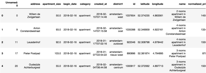
As a result of the “Obtaining our Data” step in our pipeline, we were able to get a dataset containing 1182 apartments for rent in Amsterdam as of February, 2018 in CSV format.
We start out by creating a Pandas DataFrame out of this data.
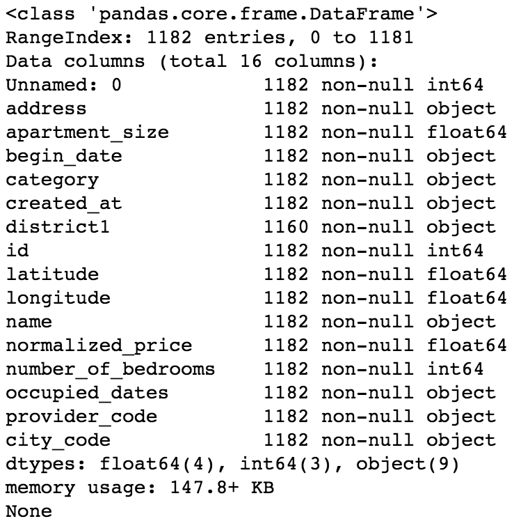
 We already know that we are dealing with a dataset containing 1182 observations. Now let’s check what are our variables and their data types.
 Now on to some statistics — let’s see some summary and dispersion measures.
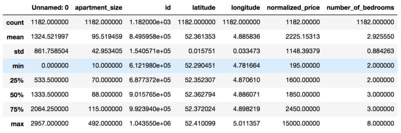 At this point we are able to draw some observations on our dataset:
- There’s a “Unnamed: 0” column, which doesn’t seem to hold important information. We’ll drop it.
- We have some variables with an “object” data type. This could be a problem if there is numerical or string data that we need to analyze. We’ll convert this to the proper data types.
- Minimum value for “number_of_bedrooms” is 2. At the same time, minimum value for “apartment_size” is 10. Sticking two bedrooms in 10 square meters sounds like a a bit of a challenge, doesn’t it? Well, it turns out that in the Netherlands, apartments are evaluated based on the number of rooms, or “kamers”, rather than the number of bedrooms. So for our dataset, when we say that the minimum number of bedrooms is 2, we are actually meaning that the minimum number of rooms is 2 (one bedroom and one living room).
- Some columns such as name, provider_code, begin_date and city_code don’t seem to add much value to our analysis, so we will drop them.
- We have some date_time fields. However, it is not possible to create a predictive model with a dataset containing this data type. We will then convert these fields to an integer, Unix Epoch encoding.
- Mean apartment rental prices is approx. EUR 2225.13. Standard deviation for apartment rental prices is approx. EUR 1148.40. It follows that in regards to normalized_price, our data is overdispersed, as the index of dispersion (variance by mean) is approximately 592.68.
Some Basic EDA — Exploratory Data Analysis
Besides doing some cleaning, as data scientists it is our job to ask our data some questions.
We have already seen some info on the quartiles, minimum, max and mean values for most of our variables. However I am more of a visual person. So let’s jump in and generate a Plot.ly box plot, so we can see a snapshot of our data.
 Looks like we have a lot of outliers — specially for apartments in Amsterdam Centrum. I guess there’s a lot of people wanting to live by the canals and the Museumplein — can’t blame them.
Let’s reduce the quantity of outliers by creating a subset of our data — perhaps a good limit for normalized_price would be EUR 3K.
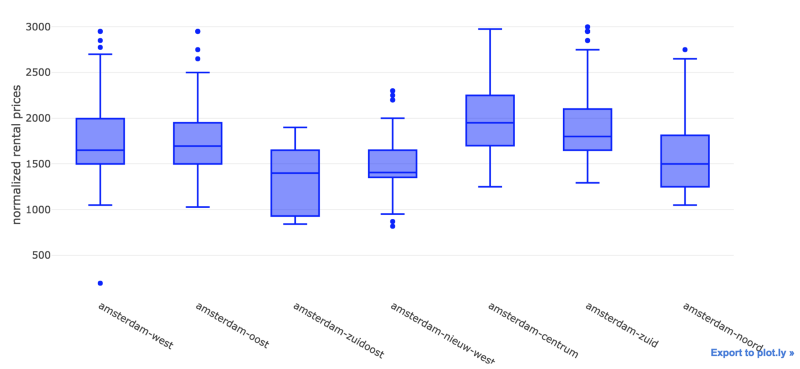 We were able to remove most of the outliers. On an initial analysis, Amsterdam Zuidoost and Amsterdam Nieuw West look like great candidates for our apartment search.
Now let’s take a look at the distribution for our data.
 By visually inspecting our distribution, we can note that it deviates from the normal distribution.
However, it is not that skewed (skewness is approximately 0.5915) nor peaked (kurtosis is approximately 0.2774).
High skewness and peakedness usually represent a problem for creating a predictive model, as some algorithms make some assumptions about training data having an (almost) normal distribution. Peakedness might influence how algorithms calculate error, thus adding bias to predictions.
As a data scientist, one should be aware of these possible caveats. Luckily, we don’t have this problem. So let’s continue our analysis. We will leverage seaborn in order to generate a pairplot. Pairplots are useful in that they provide data scientists an easy way to visualize relationships between variables from an specific dataset.
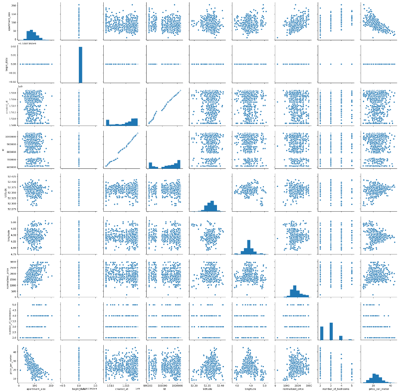 Interestingly, we have some almost linear relationships. It is true that most of them would be kind of trivial at first, e.g. normalized_price versus apartment_size, for example. But we can also see some other interesting relationships — for example, apartment_size versus price_per_meter, which seem to have an almost linear, negative relationship.
Let’s move on and plot the Pearson Correlation values between each of the variables with the help of Seaborn’s heat map. A heat map (or heatmap) is a graphical, matrix representation of data where individual values are represented as colors. Besides being a new term, the idea of “Heat map” has existed for centuries, with different names (e.g. Shaded matrices).
 Some interesting findings:
- As initially noted from our pairplot, Price per Meter and Apartment Size have indeed a considerable negative Pearson Correlation index (-0.7). That is, roughly speaking, the smaller the apartment, the higher the price per meter — around 70% of the increase in the price per meter can be explained by the decrease in apartment size. This could be due to a lot of factors, but my personal guess is that there is higher demand for smaller apartments. Amsterdam is consolidating itself as a destination for young people from the EU and from all over the world, who are usually single, or married without children. Moreover, even in families with children, the number of children per family has declined fast over the last years. And last, smaller places are more affordable for this kind of public. No scientific nor statistical basis for these remarks — just pure and simple observation and speculation.
- Normalized Price and Apartment Size have a 0.54 pearson correlation index. Which means they are correlated, but not that much. This was kind of expected, as rental price could have other components such as location, apartment conditions, and others.
- There are two white lines related to the begin_date variable. It turns out that the value of this variable is equal to 16/02/2018 for each and every observation. So obviously, there is no linear relationship between begin_date and the other variables from our dataset. Hence we will drop this variable.
- Correlation between longitude and normalized_price is negligible, almost zero. The same can be said about the correlation between longitude and price_per_meter.
A Closer Look
We’ve seen some correlation between some of our variables thanks to our pairplot and heatmap. Let’s zoom into these relationships, first size versus prize, and then size versus price (log scale). We will also investigate the relationships between price and latitude (log scale), as we are interested in knowing which are the hottest areas for hunting. Moreover, despite the correlations obtained in the last step, we will also investigate the relationship between size and latitude(log scale). Does the old & gold real estate mantra “location, location, location” holds for Amsterdam? Would this mantra also dictate apartment sizes?
We’ll find out.
 Well, we can’t really say that there is a linear relationship between these variables, at least not at this moment. Notice that we used logarithmic scale for some of the plots in order to try eliminating possible distortions due to difference between scales.
Would this be the end of the line?
The End of The Line
We did some inspection over some relationships between variables in our model. We were not able to visualize any relationship between normalized_price or price_per_meter and latitude, nor longitude.
Nevertheless, I wanted to have a more visual outlook on how these prices look geographically. What if we could see of map of Amsterdam depicting which areas are more pricey/cheap?
Using Folium, I was able to create the visualization below.
- Circle sizes were defined according to the apartment sizes, using a 0–1 scale where 1 = maximum apartment size and 0 = minimum apartment size.
- Red circles represent apartments with high price to size ratio
- Green circles represent the opposite — apartments with low price to size ratio
- Each circles shows a textbox when clicked, containing monthly rental price, in euros, along with apartment size, in square meters.
In the first seconds of the video, we are able to see some red spots in between the canals area, close to Amsterdam Centrum. As we move out this area and approach other districts such as Amsterdam Zuid, Amsterdam Zuidoost, Amsterdam West and Amsterdam Noord, we are able to see changes in this patterns — mostly green spots, composed by big green circles. Perhaps these places offer some good deals. With the map we created, it is possible to define a path in order to start hunting for a place.
So maybe there is a relationship between price and location after all?
Maybe this is the end of the line indeed. Maybe there is no linear relationship between these variables.
Going Green: Random Forests
Random forests or random decision forests are an ensemble learning method for classification, regression and other tasks, that operate by constructing a multitude of decision trees at training time and outputting the class that is the mode of the classes (classification) or mean prediction (regression) of the individual trees. Random decision forests correct for decision trees’ habit of overfitting to their training set and are useful in detecting non-linear relationships within data.
 This.Random Forests are one of my favorite Machine Learning algorithms due to some characteristics:
- Random Forests require almost no data preparation. Due to their logic, Random Forests don’t require data to be scaled. This eliminates part of the burden of cleaning and/or scaling our data
- Random Forests can be trained really fast. The random feature sub-setting that aims at diversifying individual trees, is at the same time a great performance optimization
- It is hard to go wrong with Random Forests. They are not so sensitive to hyperparameters , in opposition to Neural Networks, for example.
The list goes on. We will leverage this power and try to predict apartment rental prices with the data that we have so far. Our target variable for our Random Forest Regressor, that is, the variable that we will try to predict, will be normalized_price.
But before that, we need to do some feature engineering. We will use Scikit-learn’s Random Forest implementation, which requires us to do some encoding for categorical variables. Which in our case are district1 and address. Second, we will also drop some unimportant features. Last, we need to drop price_per_meter, a variable we created that is a proxy of normalized_price — otherwise we will have data leakage, as our model will be able to “cheat” and easily guess the apartment prices.
Training & Testing
 How overfitting usually looks like.Overfitting occurs when the model captures the noise and the outliers in the data along with the underlying pattern. These models usually have high variance and low bias. These models are usually complex like Decision Trees, SVM or Neural Networks which are prone to over fitting. It’s like a soccer player, who besides being a very good striker, does a poor job at other positions such as mid or defense. He is too good at striking goals, however does an insanely poor job at everything else.
One common way of testing for overfitting is having separate training and test sets. In our case, we will use a training set composed by 70% of our dataset, using the remaining 30% as our test set. If we get very high scores for our model when predicting target variables for our training set, but poor scores when doing the same for the test set, we possibly have overfitting.
Showdown
After training and testing our model, we were able to get the results below.
 Predicted Values in Orange; Actual Values in Blue.From the picture we can see that our model is not doing bad at predicting apartment rental prices. We were able to achieve a 0.70 R2 Score with our model, where 1 represents the best possible score and -1 represents the worst possible score.
Notice that this was our baseline model. On the second post of this series, I expand things a little bit in order to get almost 10% improvement in the model score.
You might also like
Keeping Your Machine Learning Models on the Right Track: Getting Started with MLflow, Part 1
Learn why Model Tracking and MLflow are critical for a successful machine learning projectmlopshowto.comGoing Dutch, Part 2: Improving a Machine Learning Model Using Geographical Data
Where it all Startedtowardsdatascience.com