
Going Dutch: How I Used Data Science and Machine Learning to Find an Apartment in Amsterdam — Part 1
06 Jun 2018 Amsterdam’s Real Estate Market is experiencing an incredible ressurgence, with property prices soaring by double-digits on an yearly basis since 2013. While home owners have a lot of reasons to laugh about, the same cannot be said of people looking for a home to buy or rent.
As a data scientist making the move to the old continent, this posed like an interesting subject to me. In Amsterdam, property rental market is said to be as crazy as property purchasing market. I decided to take a closer look into the city’s rental market landscape, using some tools (Python, Pandas, Matplotlib, Folium, Plot.ly and SciKit-Learn) in order to try answering the following questions:
- How does the general rental prices distribution looks like?
- Which are the hottest areas?
- Which area would be more interesting to start hunting?
And last, but not least, the cherry on the cake:
- Are we able to predict apartment rental prices?
My approach was divided into the following steps:
- Obtaining data: using Python, I was able to scrape rental apartment data from some websites.
- Data cleaning: this is usually the longest part of any data analysis process. In this case, it was important to clean the data in order to properly handle data formats, remove outliers, etc.
- EDA: some Exploratory Data Analysis in order to visualize and better understand our data.
- Predictive Analysis: in this step, I created a Machine Learning model, trained it and tested it with the dataset that I’d got in order to predict Amsterdam apartment rental prices.
- Feature Engineering: conceptualized a more robust model by tweaking our data and adding geographic features
So… let’s go Dutch
 To “Go Dutch” can be understood as splitting a bill at a restaurant or other occasions. According to The Urban Dictionary, the Dutch are known to be a bit stingy with money — not so coincidentally, an aspect I totally identify myself with. This expression comes from centuries ago; English rivalry with The Netherlands especially during the period of the Anglo-Dutch Wars gave rise to several phrases including Dutch that promote certain negative stereotypes.
Going back to our analysis, we will “go dutch” in order to try to find some bargains.
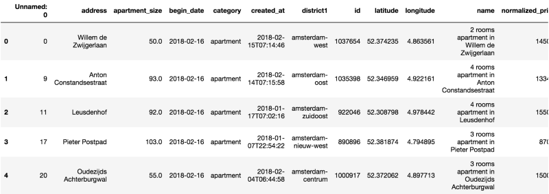
As a result of the “Obtaining our Data” step in our pipeline, we were able to get a dataset containing 1182 apartments for rent in Amsterdam as of February, 2018 in CSV format.
We start out by creating a Pandas DataFrame out of this data.
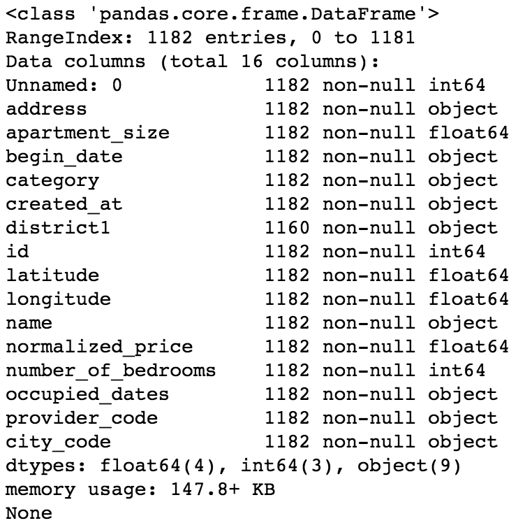
 We already know that we are dealing with a dataset containing 1182 observations. Now let’s check what are our variables and their data types.
 Now on to some statistics — let’s see some summary and dispersion measures.
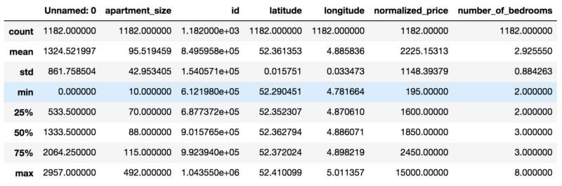 At this point we are able to draw some observations on our dataset:
- There’s a “Unnamed: 0” column, which doesn’t seem to hold important information. We’ll drop it.
- We have some variables with an “object” data type. This could be a problem if there is numerical or string data that we need to analyze. We’ll convert this to the proper data types.
- Minimum value for “number_of_bedrooms” is 2. At the same time, minimum value for “apartment_size” is 10. Sticking two bedrooms in 10 square meters sounds like a a bit of a challenge, doesn’t it? Well, it turns out that in the Netherlands, apartments are evaluated based on the number of rooms, or “kamers”, rather than the number of bedrooms. So for our dataset, when we say that the minimum number of bedrooms is 2, we are actually meaning that the minimum number of rooms is 2 (one bedroom and one living room).
- Some columns such as name, provider_code, begin_date and city_code don’t seem to add much value to our analysis, so we will drop them.
- We have some date_time fields. However, it is not possible to create a predictive model with a dataset containing this data type. We will then convert these fields to an integer, Unix Epoch encoding.
- Mean apartment rental prices is approx. EUR 2225.13. Standard deviation for apartment rental prices is approx. EUR 1148.40. It follows that in regards to normalized_price, our data is overdispersed, as the index of dispersion (variance by mean) is approximately 592.68.
Some Basic EDA — Exploratory Data Analysis
Besides doing some cleaning, as data scientists it is our job to ask our data some questions.
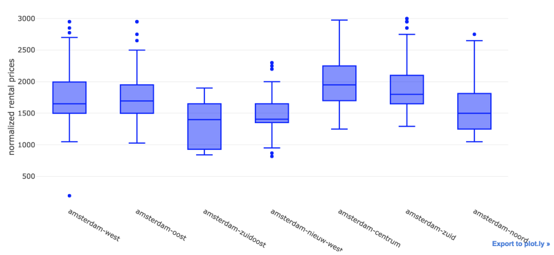
We have already seen some info on the quartiles, minimum, max and mean values for most of our variables. However I am more of a visual person. So let’s jump in and generate a Plot.ly box plot, so we can see a snapshot of our data.
 Looks like we have a lot of outliers — specially for apartments in Amsterdam Centrum. I guess there’s a lot of people wanting to live by the canals and the Museumplein — can’t blame them.
Let’s reduce the quantity of outliers by creating a subset of our data — perhaps a good limit for normalized_price would be EUR 3K.
 We were able to remove most of the outliers. On an initial analysis, Amsterdam Zuidoost and Amsterdam Nieuw West look like great candidates for our apartment search.
Now let’s take a look at the distribution for our data.
 By visually inspecting our distribution, we can note that it deviates from the normal distribution.
However, it is not that skewed (skewness is approximately 0.5915) nor peaked (kurtosis is approximately 0.2774).
High skewness and peakedness usually represent a problem for creating a predictive model, as some algorithms make some assumptions about training data having an (almost) normal distribution. Peakedness might influence how algorithms calculate error, thus adding bias to predictions.
As a data scientist, one should be aware of these possible caveats. Luckily, we don’t have this problem. So let’s continue our analysis. We will leverage seaborn in order to generate a pairplot. Pairplots are useful in that they provide data scientists an easy way to visualize relationships between variables from an specific dataset.
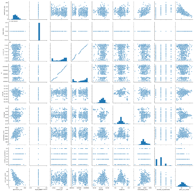 Interestingly, we have some almost linear relationships. It is true that most of them would be kind of trivial at first, e.g. normalized_price versus apartment_size, for example. But we can also see some other interesting relationships — for example, apartment_size versus price_per_meter, which seem to have an almost linear, negative relationship.
Let’s move on and plot the Pearson Correlation values between each of the variables with the help of Seaborn’s heat map. A heat map (or heatmap) is a graphical, matrix representation of data where individual values are represented as colors. Besides being a new term, the idea of “Heat map” has existed for centuries, with different names (e.g. Shaded matrices).
 Some interesting findings:
- As initially noted from our pairplot, Price per Meter and Apartment Size have indeed a considerable negative Pearson Correlation index (-0.7). That is, roughly speaking, the smaller the apartment, the higher the price per meter — around 70% of the increase in the price per meter can be explained by the decrease in apartment size. This could be due to a lot of factors, but my personal guess is that there is higher demand for smaller apartments. Amsterdam is consolidating itself as a destination for young people from the EU and from all over the world, who are usually single, or married without children. Moreover, even in families with children, the number of children per family has declined fast over the last years. And last, smaller places are more affordable for this kind of public. No scientific nor statistical basis for these remarks — just pure and simple observation and speculation.
- Normalized Price and Apartment Size have a 0.54 pearson correlation index. Which means they are correlated, but not that much. This was kind of expected, as rental price could have other components such as location, apartment conditions, and others.
- There are two white lines related to the begin_date variable. It turns out that the value of this variable is equal to 16/02/2018 for each and every observation. So obviously, there is no linear relationship between begin_date and the other variables from our dataset. Hence we will drop this variable.
- Correlation between longitude and normalized_price is negligible, almost zero. The same can be said about the correlation between longitude and price_per_meter.
A Closer Look
We’ve seen some correlation between some of our variables thanks to our pairplot and heatmap. Let’s zoom into these relationships, first size versus prize, and then size versus price (log scale). We will also investigate the relationships between price and latitude (log scale), as we are interested in knowing which are the hottest areas for hunting. Moreover, despite the correlations obtained in the last step, we will also investigate the relationship between size and latitude(log scale). Does the old & gold real estate mantra “location, location, location” holds for Amsterdam? Would this mantra also dictate apartment sizes?
We’ll find out.
 Well, we can’t really say that there is a linear relationship between these variables, at least not at this moment. Notice that we used logarithmic scale for some of the plots in order to try eliminating possible distortions due to difference between scales.
Would this be the end of the line?
The End of The Line
We did some inspection over some relationships between variables in our model. We were not able to visualize any relationship between normalized_price or price_per_meter and latitude, nor longitude.
Nevertheless, I wanted to have a more visual outlook on how these prices look geographically. What if we could see of map of Amsterdam depicting which areas are more pricey/cheap?
Using Folium, I was able to create the visualization below.
- Circle sizes were defined according to the apartment sizes, using a 0–1 scale where 1 = maximum apartment size and 0 = minimum apartment size.
- Red circles represent apartments with high price to size ratio
- Green circles represent the opposite — apartments with low price to size ratio
- Each circles shows a textbox when clicked, containing monthly rental price, in euros, along with apartment size, in square meters.
In the first seconds of the video, we are able to see some red spots in between the canals area, close to Amsterdam Centrum. As we move out this area and approach other districts such as Amsterdam Zuid, Amsterdam Zuidoost, Amsterdam West and Amsterdam Noord, we are able to see changes in this patterns — mostly green spots, composed by big green circles. Perhaps these places offer some good deals. With the map we created, it is possible to define a path in order to start hunting for a place.
So maybe there is a relationship between price and location after all?
Maybe this is the end of the line indeed. Maybe there is no linear relationship between these variables.
Going Green: Random Forests
Random forests or random decision forests are an ensemble learning method for classification, regression and other tasks, that operate by constructing a multitude of decision trees at training time and outputting the class that is the mode of the classes (classification) or mean prediction (regression) of the individual trees. Random decision forests correct for decision trees’ habit of overfitting to their training set and are useful in detecting non-linear relationships within data.
 This.Random Forests are one of my favorite Machine Learning algorithms due to some characteristics:
- Random Forests require almost no data preparation. Due to their logic, Random Forests don’t require data to be scaled. This eliminates part of the burden of cleaning and/or scaling our data
- Random Forests can be trained really fast. The random feature sub-setting that aims at diversifying individual trees, is at the same time a great performance optimization
- It is hard to go wrong with Random Forests. They are not so sensitive to hyperparameters , in opposition to Neural Networks, for example.
The list goes on. We will leverage this power and try to predict apartment rental prices with the data that we have so far. Our target variable for our Random Forest Regressor, that is, the variable that we will try to predict, will be normalized_price.
But before that, we need to do some feature engineering. We will use Scikit-learn’s Random Forest implementation, which requires us to do some encoding for categorical variables. Which in our case are district1 and address. Second, we will also drop some unimportant features. Last, we need to drop price_per_meter, a variable we created that is a proxy of normalized_price — otherwise we will have data leakage, as our model will be able to “cheat” and easily guess the apartment prices.
Training & Testing
 How overfitting usually looks like.Overfitting occurs when the model captures the noise and the outliers in the data along with the underlying pattern. These models usually have high variance and low bias. These models are usually complex like Decision Trees, SVM or Neural Networks which are prone to over fitting. It’s like a soccer player, who besides being a very good striker, does a poor job at other positions such as mid or defense. He is too good at striking goals, however does an insanely poor job at everything else.
One common way of testing for overfitting is having separate training and test sets. In our case, we will use a training set composed by 70% of our dataset, using the remaining 30% as our test set. If we get very high scores for our model when predicting target variables for our training set, but poor scores when doing the same for the test set, we possibly have overfitting.
Showdown
After training and testing our model, we were able to get the results below.
 Predicted Values in Orange; Actual Values in Blue.From the picture we can see that our model is not doing bad at predicting apartment rental prices. We were able to achieve a 0.70 R2 Score with our model, where 1 represents the best possible score and -1 represents the worst possible score.
Notice that this was our baseline model. On the second post of this series, I expand things a little bit in order to get almost 10% improvement in the model score.
You might also like
Keeping Your Machine Learning Models on the Right Track: Getting Started with MLflow, Part 1
Learn why Model Tracking and MLflow are critical for a successful machine learning projectmlopshowto.comGoing Dutch, Part 2: Improving a Machine Learning Model Using Geographical Data
Where it all Startedtowardsdatascience.com